Declutter like a Mother f***er! The boldly branded storage facility that's impossible to ignore.
Challenge
The self-storage sector is arguably one of the dullest, most transactional industries on the planet. For Brown Box Storage, the challenge wasn't just to open a chain of facilities across the Midlands; it was to launch a brand that people actually connected with.
Every competitor zigs with generic promises of "security" and "low prices," resulting in an ocean of sterile blue and yellow signage.
Our client needed to disrupt this saturated market and quickly become a leader. The objective, get noticed by doing something different and back it up with authenticity. They recognised that without a powerful, witty, and human personality they would simply become another beige warehouse fighting on price. The core task was to inject genuine connection and expertise you can trust into a business model designed for cold detachment.
Solution
Unrattled began by translating Brown Box's honest, family-owned ethos into a comprehensive Brand Identity & Strategic Positioning.
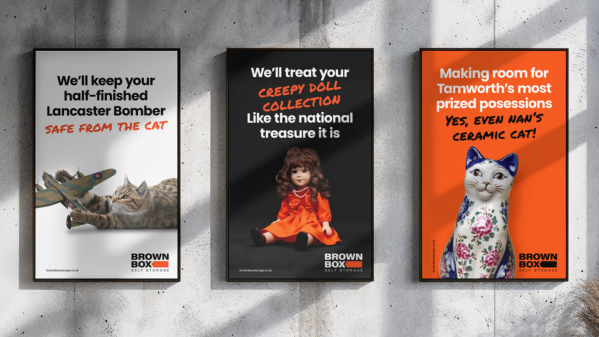
We recognised that self-storage is rarely a happy decision; it’s a consequence of real-life stress (moving, divorcing, growing a business). We chose to validate that stress with humour:
Strategic Positioning:
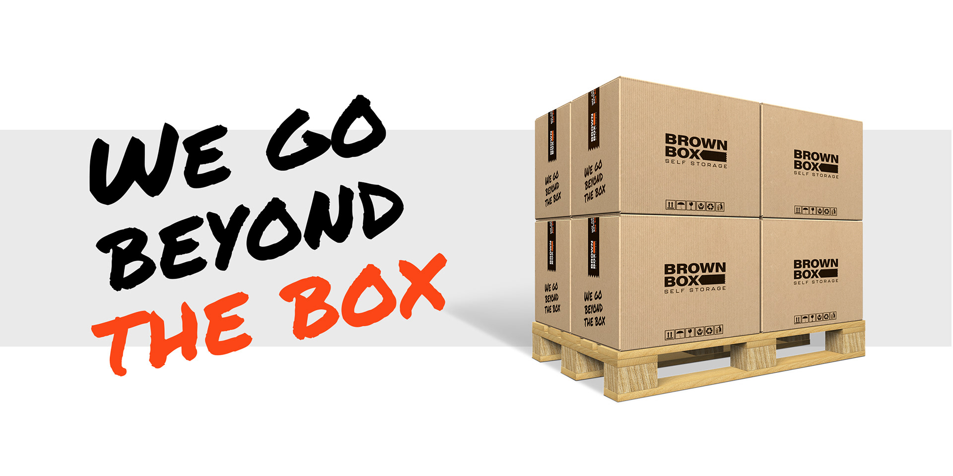
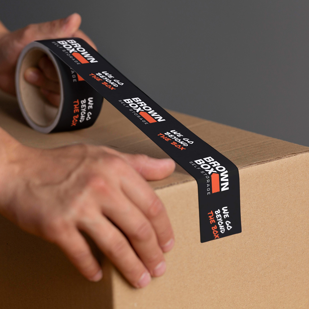
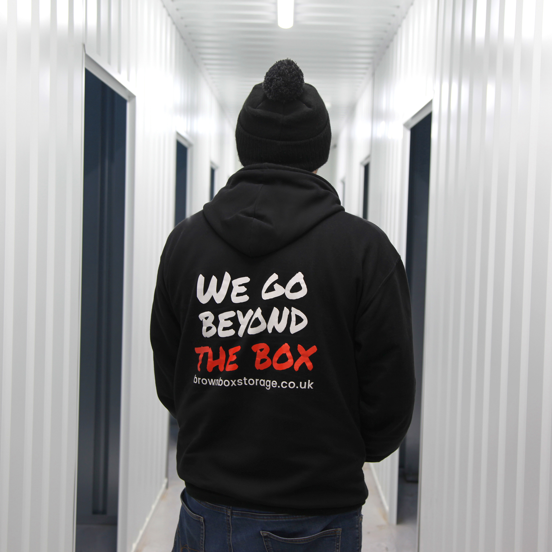
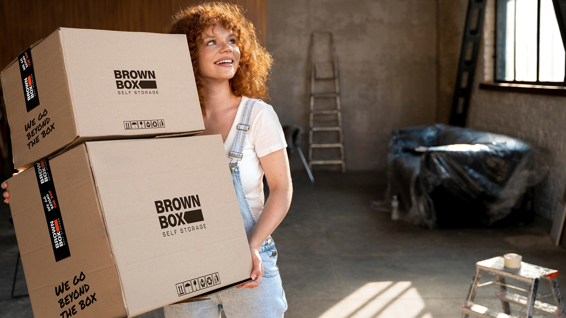
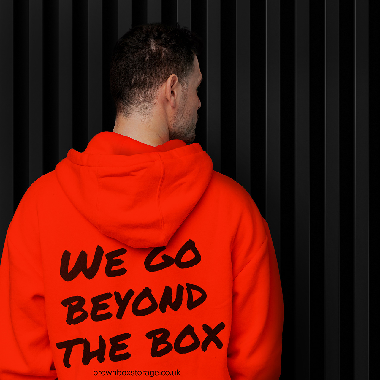
We defined the USP as the "Never boring, anti-stress storage solution," positioning the business as part of the community helping to make its 'neighbours' lives simpler, one witty interaction at a time. supported by the official brand strap-line: 'We Go Beyond The Box.' This phrase encapsulates Brown Box's commitment to delivering a radically superior and considered customer experience.
We defined the USP as the "Never boring, anti-stress storage solution," positioning the business as part of the community helping to make its 'neighbours' lives simpler, one witty interaction at a time. supported by the official brand strap-line: 'We Go Beyond The Box.' This phrase encapsulates Brown Box's commitment to delivering a radically superior and considered customer experience.
The Copywriting Weapon:
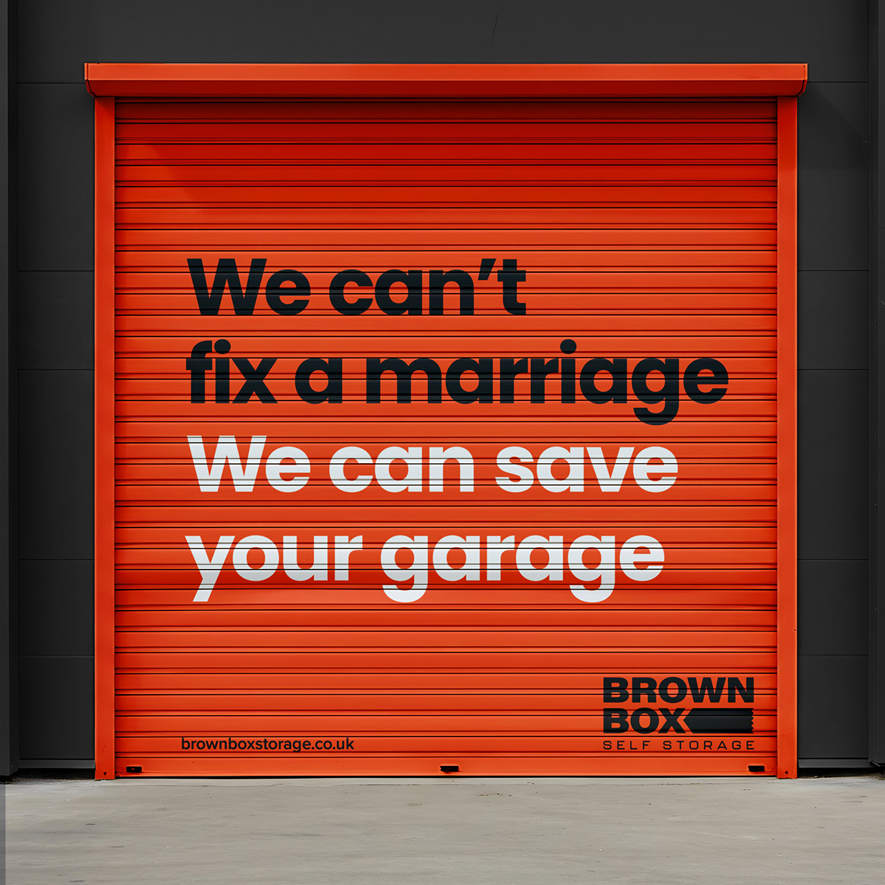
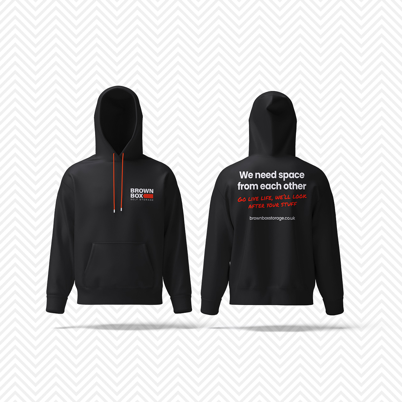
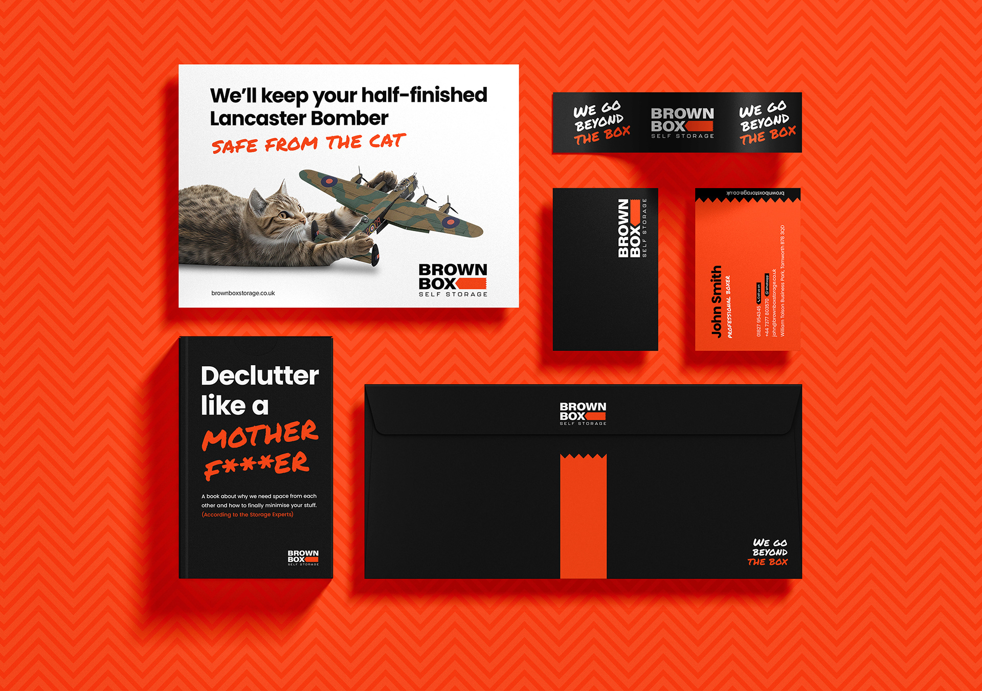
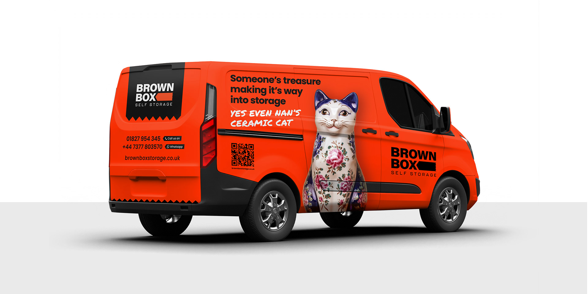
Our creative copywriting became the primary brand asset. We deployed the exterior building line: "We need space from one another (go live your life, we’ll watch your stuff)" and the bold copy line: "We can't save your marriage, but we can fix your garage." This honesty created instant, authentic connection. However, it isn't just about witty communications; it's about a deep, empathetic understanding of their customers' lives.
Our creative copywriting became the primary brand asset. We deployed the exterior building line: "We need space from one another (go live your life, we’ll watch your stuff)" and the bold copy line: "We can't save your marriage, but we can fix your garage." This honesty created instant, authentic connection. However, it isn't just about witty communications; it's about a deep, empathetic understanding of their customers' lives.
Crafting the visual identity:
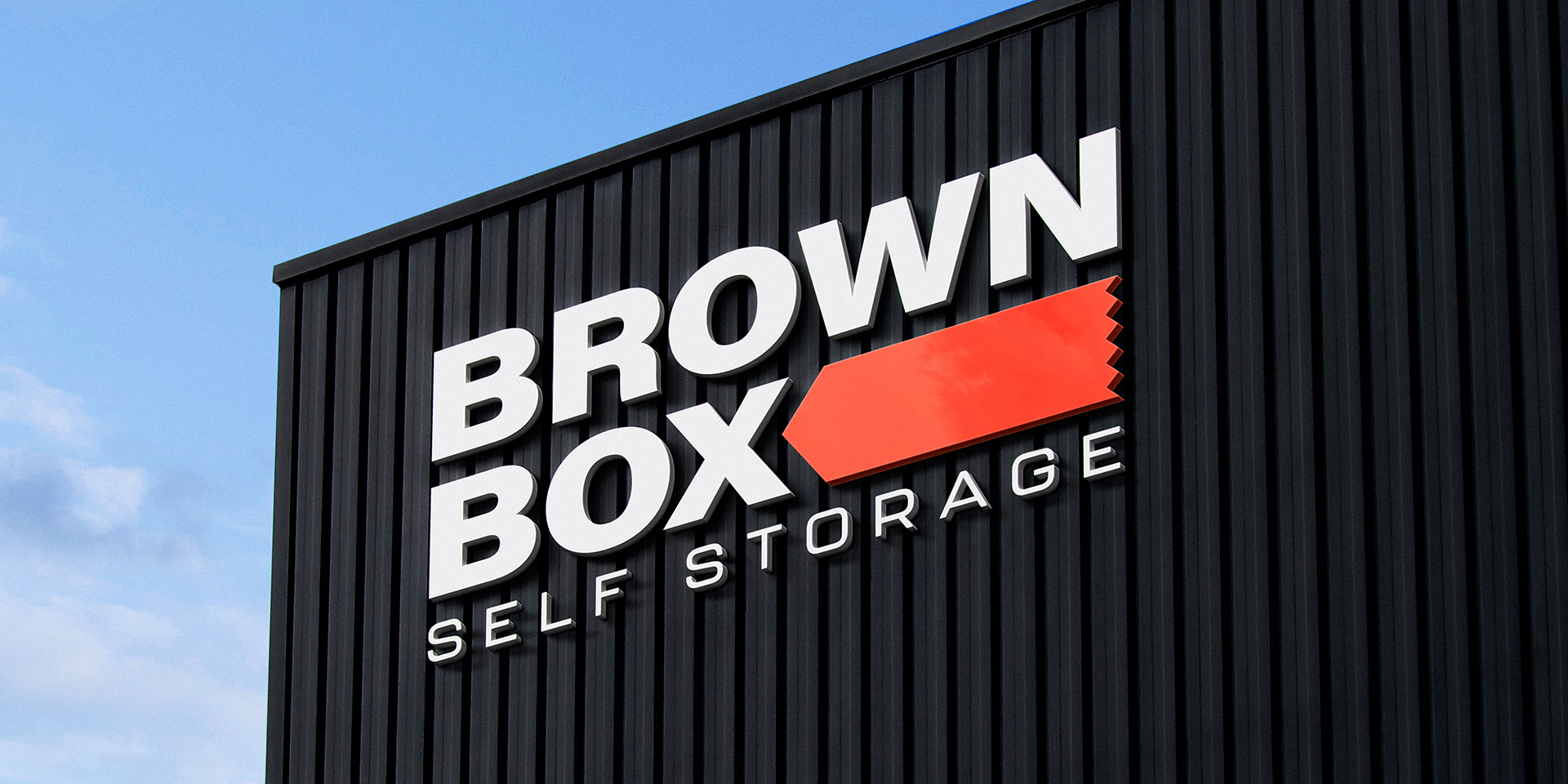
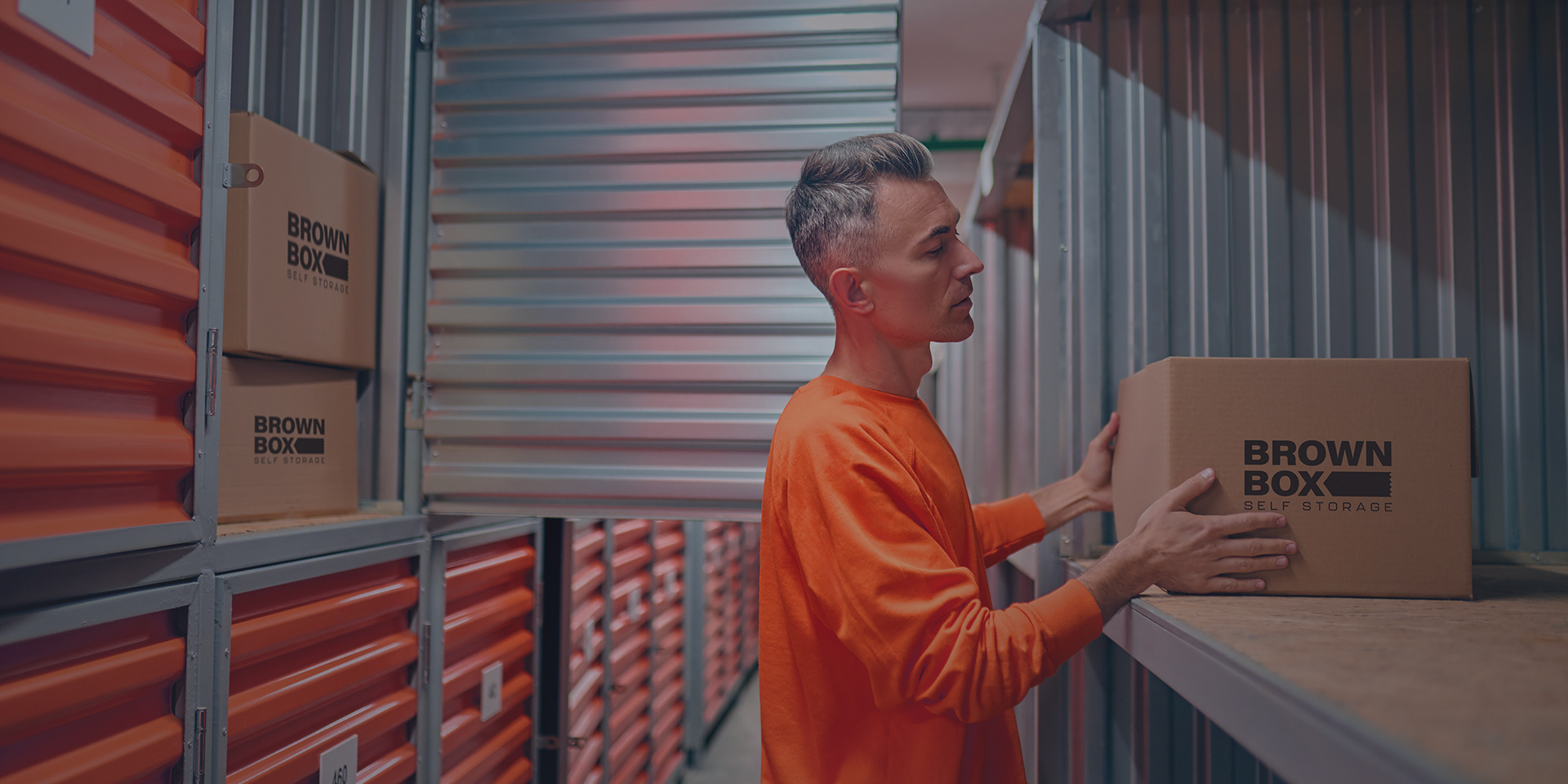
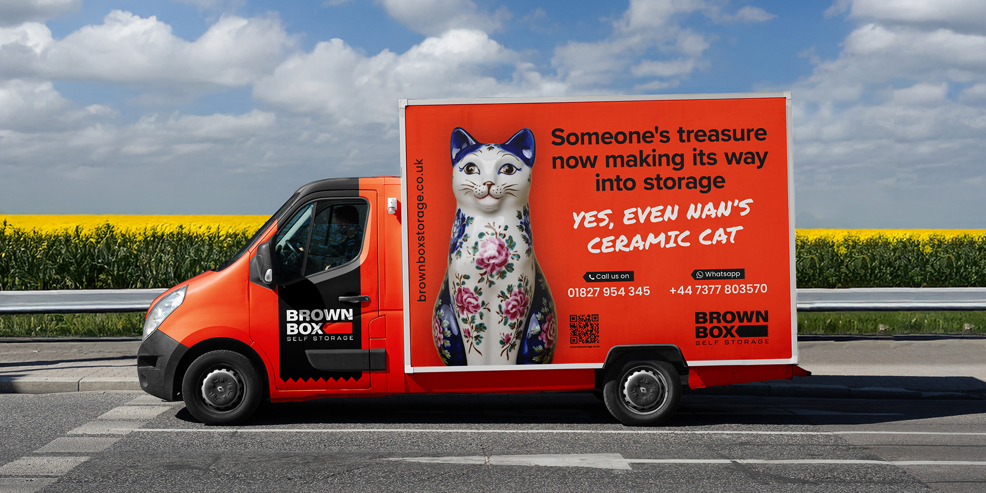
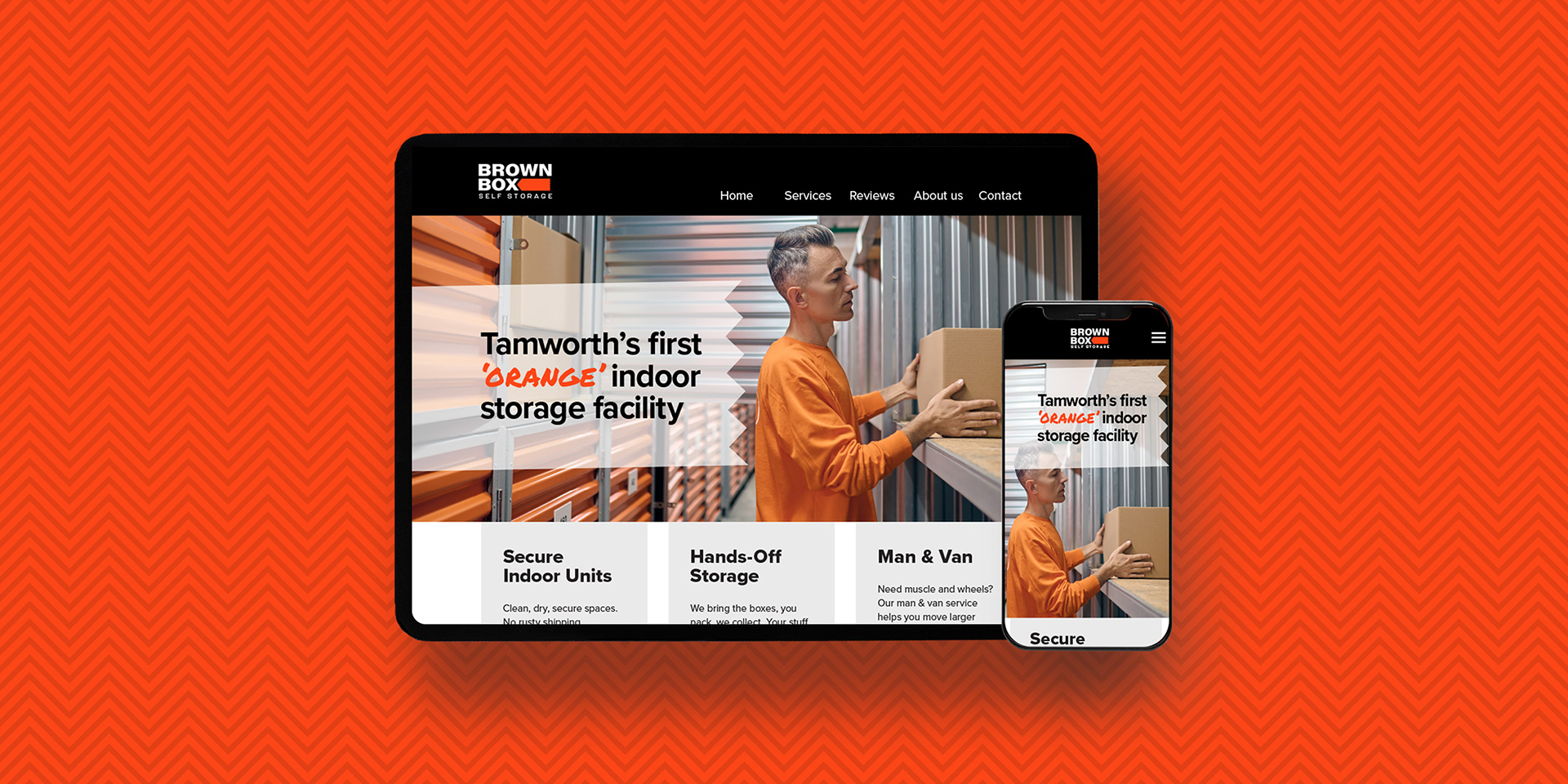
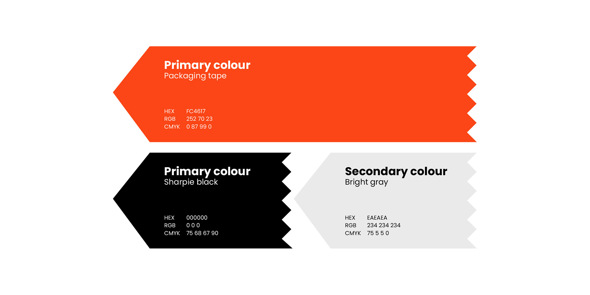
The visual identity was engineered for readability, warmth, and disruptive confidence. We strategically bypassed the industry's cold blue and yellow palette, instead anchoring the brand with a warm, energetic orange that conveyed approachability. Typography was a key differentiator: we paired a bold, contemporary font for authority with a secondary handwritten font (evoking the aesthetic of human labelled storage boxes) to inject personality. This cohesive design, featuring the distinctive parcel-tape brand mark within the logo, was robustly applied across high-impact vehicle livery, employee uniforms, and site signage, ensuring the brand never felt sterile or cheap.
The visual identity was engineered for readability, warmth, and disruptive confidence. We strategically bypassed the industry's cold blue and yellow palette, instead anchoring the brand with a warm, energetic orange that conveyed approachability. Typography was a key differentiator: we paired a bold, contemporary font for authority with a secondary handwritten font (evoking the aesthetic of human labelled storage boxes) to inject personality. This cohesive design, featuring the distinctive parcel-tape brand mark within the logo, was robustly applied across high-impact vehicle livery, employee uniforms, and site signage, ensuring the brand never felt sterile or cheap.
The Ultimate 'Zag':
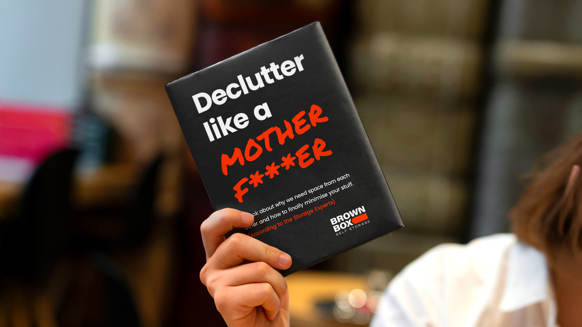
To prove their expertise and double down on their commitment to bold personality, we conceived the branded book, "DECLUTTER LIKE A MOTHER F***ER." This act immediately transforms the facility's reception into a place of personality and establishes Brown Box as a source of expert knowledge rather than just another boring storage supplier. It will be leveraged for direct sales, strategically gifted to high-value customers, and utilised as memorable merchandise for targeted publicity and PR initiatives. Also the book is currently available on Amazon and will be used as an online lead magnet to further foster brand engagement online.
To prove their expertise and double down on their commitment to bold personality, we conceived the branded book, "DECLUTTER LIKE A MOTHER F***ER." This act immediately transforms the facility's reception into a place of personality and establishes Brown Box as a source of expert knowledge rather than just another boring storage supplier. It will be leveraged for direct sales, strategically gifted to high-value customers, and utilised as memorable merchandise for targeted publicity and PR initiatives. Also the book is currently available on Amazon and will be used as an online lead magnet to further foster brand engagement online.
We didn't just design a logo; we provided the strategic roadmap and creative firepower necessary to disrupt the local market whilst building immediate brand equity.
Results
The ultimate measure of success is momentum, and the Brown Box Storage brand is already in high-growth mode before its official launch.
Immediate Expansion:
The brand's foundational success and clear vision have already led to the proposed acquisition of two additional sites, which Unrattled will be overseeing the branding of, in the coming year.
The brand's foundational success and clear vision have already led to the proposed acquisition of two additional sites, which Unrattled will be overseeing the branding of, in the coming year.
Operational Integration:
The core brand strategy and unique tone of voice is actively being used as the blueprint for employee training and customer service, guaranteeing expert consistency and personality is present across every single touchpoint.
The core brand strategy and unique tone of voice is actively being used as the blueprint for employee training and customer service, guaranteeing expert consistency and personality is present across every single touchpoint.
GET IN TOUCH
Thank you!